Creating Bottom Navigation in Android
What is Bottom Navigation?
Bottom navigation bars make it easy to explore and switch between top-level views in a single tap. — Material Design spec
This helps developers opt for Bottom Navigation, instead of a Navigation Drawer.
If you have about four top-level navigation items, its ideal to use Bottom Navigation. Otherwise, go for a Navigation Drawer. We don’t want the Bottom Navigation looking too crowded now, do we?
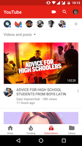
This was already common for iOS apps. But now, a lot of Android apps have started adapting this. To name a few, the YouTube app recently made the switch.
When to use?
A Bottom Navigation is best used when you have three to five top-level navigation items of similar importance.
Until now, the default, go-to navigation solution is the Navigation Drawer. Would you agree?
Grab all your screens, throw them in the Navigation Drawer and we’re done. I don’t blame you. Once upon a time, I was guilty of the same.
For just 4 navigation screens, would you use an entire Navigation Drawer for it? Besides, that huge side menu is hidden away by a tiny hamburger menu.
Think of the benefits a Bottom Navigation provides:
- always visible — its omnipresent no matter which of the 4 screens you visit
- simpler — lesser the options, easier to remember
So given all that, in such a scenario, a Bottom Navigation will serve you the best.
A simpler way to look at it…
If all that seems too complex, then just keep the number of navigation screens in mind.
- 2 screens — Tabs
- 3 to 5 screens — Bottom Navigation
- 5 and above — Navigation Drawer
First, start by adding the library’s dependency to your build.gradle file.
dependencies {
    //...
    compile 'com.aurelhubert:ahbottomnavigation:2.0.4'
}
NOTE:
I hope your app supports minSdk >14. If not, make sure you do, because this library supports 14 and above only. Seriously, why are you supporting 0.99% of the (ancient) devices!?
I hope your app supports minSdk >14. If not, make sure you do, because this library supports 14 and above only. Seriously, why are you supporting 0.99% of the (ancient) devices!?
Adding Bottom Navigation to Layout
Make sure your parent layout is a
CoordinatorLayout. This ensures the Bottom Navigation behaves correctly with Snackbar and FAB.<android.support.design.widget.CoordinatorLayout
android:id="@+id/coordinator"
android:layout_width="match_parent"
android:layout_height="match_parent">
<android.support.design.widget.AppBarLayout
        android:layout_width="match_parent"
        android:layout_height="wrap_content">
<android.support.v7.widget.Toolbar
            android:id="@+id/toolbar"
            android:layout_width="match_parent"
            android:layout_height="?attr/actionBarSize"
            android:background="?attr/colorPrimary"/>
</android.support.design.widget.AppBarLayout>
<FrameLayout
        android:id="@+id/frame"
        android:layout_width="match_parent"
        android:layout_height="match_parent"
          app:layout_behavior="@string/appbar_scrolling_view_behavior"/>
<com.aurelhubert.ahbottomnavigation.AHBottomNavigation
        android:id="@+id/bottom_navigation"
        android:layout_width="match_parent"
        android:layout_height="wrap_content"
        android:layout_gravity="bottom"/>
</android.support.design.widget.CoordinatorLayout>
The
FrameLayout with ID @+id/frame is the placeholder UI to load our Fragment.Moving onto Java
Each Bottom Navigation bar item denotes a different color. For demonstration purposes, each item click will change the
Fragment’s view color. But ideally, you’ll want to load a different Fragment for each item. I’ll tell you how to switch Fragments, a bit further into the article.
Initializing and using the Bottom Navigation is easy as one two three. I ain’t even kidding. See for yourself!
1. Create your Items
There are different constructors you can use to define your Bottom Navigation items.
At the least, you must provide a title and icon. In other words, a
String and Drawable.
Both parameters can be hardcoded Strings. But for the sake of good practice, lets reference both from XML resources.
AHBottomNavigationItem item1 =
    new AHBottomNavigationItem(R.string.bottomnav_title_0,
                               R.drawable.ic_map_24dp);
2. Add Bottom Navigation items
Once you’ve defined the number of items, its time to add them to the Bottom Navigation.
bottomNavigation.addItem(item1);
3. Set Listener
Finally, you need to listen to item clicks. So add the following to your
Fragment.bottomNavigation.setOnTabSelectedListener(new AHBottomNavigation.OnTabSelectedListener() {
@Override
public void onTabSelected(int position, boolean wasSelected) {
fragment.updateColor(Color.parseColor(colors[position]));
}
});
I have a tiny card layout centered in my
Fragment layout. Depending on the item click, I change its color.
Also, don’t forget to set your default item. This item depicts the default (home) screen which people will see.
// Setting the very 1st item as home screen. bottomNavigation.setCurrentItem(0);
Ideally, you’d want to change the
Fragment here. The same way when creating a Navigation Drawer in Android. More on this later.
Comments
Post a Comment