Styling Bottom Navigation
Styling Bottom Navigation
Off the bat, the library provides considerable styling options. But after recent updates, there has been a lot more.
Some of these additions include notification badges and coordinating behaviors. It also includes on-scroll Quick Return pattern.
Its all that one could ever want with the Bottom Navigation. This library is much more feature-rich than what Android Design Support Library offers. So if you want more customization options and more control, you know what to use.
Before we get to that, here’s a heads-up. We’ll be using and referencing a lot of colors. Normally, we reference colors in Android like this:
ContextCompat.getColor(context, R.id.yourcolor);
Now I’m no fan of writing such a lengthy line for fetching a simple color resource.
So I’ll write a simple method that shortens what I have to type.
private int fetchColor(@ColorRes int color) {
        return ContextCompat.getColor(this, color);
}
Great! From now on I don’t have to write long lines. This simple method call will do to fetch my color resource.
TIP:
Hiding the complexities of a system by providing a simpler interface is known as the Facade Design Pattern.
Hiding the complexities of a system by providing a simpler interface is known as the Facade Design Pattern.
With that out of the way, let’s look at implementing all the possible styling options.
Simple Theming
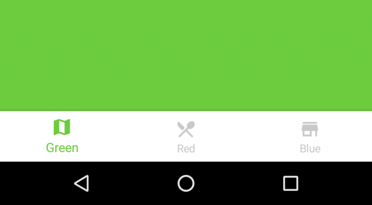
At the most basic level, the Bottom Navigation requires these attributes:
- Default background color
- Accent color — highlights active items
- Inactive color — (you guessed it!) color for inactive items
bottomNavigation.setDefaultBackgroundColor(Color.WHITE);
bottomNavigation.setAccentColor(fetchColor(R.color.yourAccentColor));
bottomNavigation.setInactiveColor(fetchColor(R.color.yourInactiveColor));
With such basic styling, you can expect your Bottom Navigation to look like this.
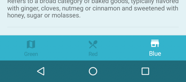
Color Ripple Effects
You can take styling a step further by using a color ripple.
Yes, I’m talking about this.
The good news is that its easy to enable a colored ripple.
//  Enables color Reveal effect
bottomNavigation.setColored(true);
// Colors for selected (active) and non-selected items (in color reveal mode).
bottomNavigation.setColoredModeColors(Color.WHITE,
                fetchColor(R.color.bottomtab_item_resting));
The method
setColoredModeColors() defines the colors for items when using color ripple.Text Labels
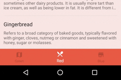
Here’s what the Material Design documentation tells us. If Bottom Navigation has:
- 3 items — display icon and text always for all items
- 4–5 items — display text for active icon only and hide for inactive views
Now, you might have a good guess on what I’m going to say next.
“This is what the Material Design guidelines suggest, so let’s do just that”.
But this time I won’t. I disagree, and so should you. I’ll tell you why.
The Material Design guidelines aren’t always right
Whether you have 3 or 5 items in your Bottom Navigation, ALWAYS show text labels!
By doing so, you’ll avoid the Mystery Meat Navigation problem that plagues Material Design. Shoutout to Teo Yu Siang for making aware of this!
Buttons or links that don’t explain to you what they do. Instead, you have to click on them to find out — Mystery Meat Navigation.
I’m sure we’ve all been victims of this at some point at least. We click on a button assuming it to do something, only for it to do something else entirely!
So do yourselves, and your users a favor. Always, show text labels for your Bottom Navigation icons.
bottomNavigation.setTitleState(AHBottomNavigation.TitleState.ALWAYS_SHOW);
I did my part to give good UX. What about you?
Translucent Bottom Navigation
First, you create an app Theme that supports translucent navigation.
<style name="MyTheme.TranslucentNavigation" parent="MyTheme">
       <item name="android:windowTranslucentNavigation">true</item>
</style>
Next, in your AndroidManifest.xml, apply this Theme to your Bottom Navigation
Activity.// ...
<activity
android:name=".YourActivity"
android:theme="@style/MyTheme.TranslucentNavigation">
//...
Finally, the last step is to add one simple line to YourActivity.java.
bottomNavigation.setTranslucentNavigationEnabled(true);
Behaviors
The library allows on-scroll animation for the Bottom Navigation Bar. It also supports a Translucent Theme for the same. Let’s see how we can enable both.
Quick Return Animation
A View can scroll off-screen with the content and return when the user reverse scrolls. — Quick Return
This is a popular Animation pattern that helps maximize screen estate while scrolling. Usually the Quick Return animation pattern is used for Toolbars.
The good new is, this library allows us to enable the same for Bottom Navigation. You just have to add this simple line.
bottomNavigation.setBehaviorTranslationEnabled(true);
Comments
Post a Comment